I'm not saying the genre had a perfect track record but there's nothing quite like a damn good Metal album cover, hence why I'm focusing entirely on them for this post as opposed to album covers in general. However, despite my love for the genre's artwork, there are examples where the band or whoever pitched the idea to the artist should've thought it through a little more.
Time to look at some of the Dos & Don'ts of creating an awesome Metal album cover with a couple of examples of my personal favourites along the way, in case you care about that sort of trivia.
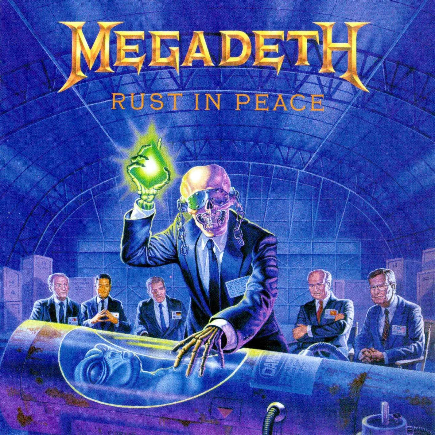
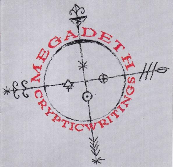
DO relate your cover to the content on the album

Not only that but it helps differentiate a career of striking artwork, compared to the Warpig collection of Motorhead album covers that are all but interchangeable. Sure, they look great in small spaced out doses but I challenge you to name the differences between Overkill, Another Perfect Day and Rock 'N' Roll without looking at pictures of them first.
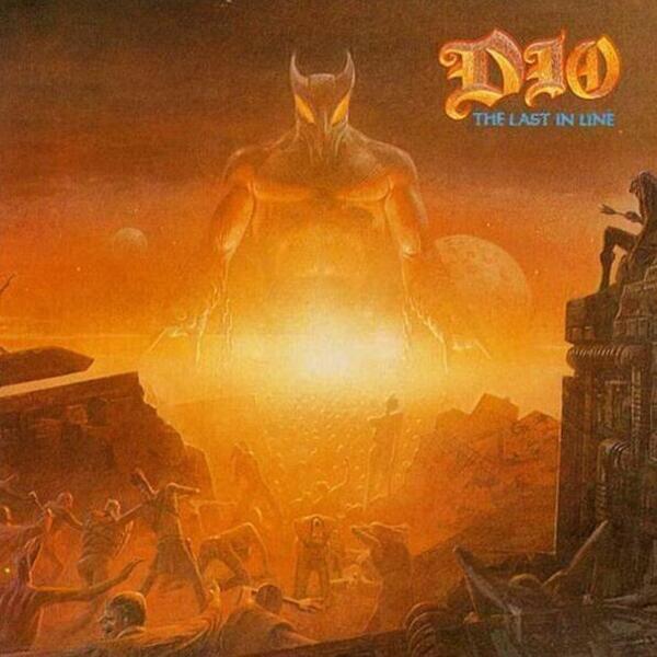
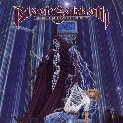
DO base the work around one strong colour (usually blue or red)
The idea behind covers is that it needs to make the object stand out, whether it's for a book, DVD cover or incredible Metal album. The problem with album covers that use realistic photographs is that they blend in, whereas the album covers that perfectly combine realism in the drawings with the use of colour to make it stand out are almost always at the top of Greatest Metal Album Covers lists, or at least they should be.
Not convinced? Let's take a look at some other notable covers.
DO try to shock

There's nothing wrong with safe album covers but if you want it to stand out and be truly awesome, you've got to make it eye-catching beyond colour. It's got to leave an impression and one surefire way to do that is to make it visually shocking. It'll make people more likely to give it a second and much longer glance, allowing them to take in the intricate details once the initial shock has faded.


DON'T hire a poor artist

No, I'm not saying this is poor and I'm not using poor in the financial sense. It's often quite hard to find information on the artists behind great album covers but most Metal fans will be able to tell you about Derek Riggs and Ed Repka, the artists who gave us Eddie The Head and Vic Rattlehead respectively. These guys create incredible works of art to match the art within the album sleeve itself. However, it's often quite hard to pinpoint what is and isn't great in the world of art...until now, anyway.
Take a look at the album cover above. Pretty fucking cool, huh. Now take a look at the cover below.

The difference is clear. One looks like something out of an acclaimed graphic novel, the other looks like it was painted on the side of a van known for being the only thing rape victims remember in their roofie-induced fugue.
Make sure you pick the right artist, especially in a day and age where it's not exactly hard to find amazingly talented individuals posting their work all over the Internet.
DON'T neglect your mascot
Some bands are known for using a character on their album covers such as The Guy, Murray or the aforementioned Vic Rattlehead. However, sometimes the band decides to take a break from their beloved mascot and goes in a completely different direction. Unfortunately, this new direction is often a worse one as proven by the album cover up above that looks like a bored teen drew it on their workbook in class.
I'm not entirely sure why bands would want to abandon their mascot when they've been established as an iconic unofficial band member, as the whole point of a mascot is to represent their music and image. Changing or even retiring them signifies a change to the band, something that fans are rarely ever happy with, and showing that with pride on the front of your album is a poor way to start the experience off.
Also, I'm aware that I had a pop at Motorhead album covers that use the mascot but my issue there isn't the use of Warpig; it's the lack of interesting designs other than "OOOFIERY-ESPLOSION!". I mean, just look at how many variants of Eddie The Head there have been in the 80's alone.
DON'T use real life photographs on the front

I'll admit that there are some exceptions to this, such as Diary Of A Madman and Vulgar Display Of Power, but real photography definitely feels more appropriate on the inner sleeve or back cover (unless it's a Southern Rock album, then real photography works). In the same way realistic gameplay can make a video game less fun, real life photography can limit what you can include on the artwork unless you decide to fuck it off and fill it with CGI anyway. Remember, this isn't a college photography assignment and just because it's black and white doesn't mean it's deep. It's a fucking Heavy Metal album cover, make it pack a punch!
There's something special about a meticulously detailed piece of artwork, something that just makes the album look like more care and attention has gone into making it awesome that a simple photograph can't even hope to match. Unfortunately, drawn artwork on album covers is now considered quite dated when compared to the average album cover from modern acts such as Avenged Sevenfold and Rob Zombie but thankfully, some new bands are still keeping the tradition alive.


Took me ages to find that last one but I'm glad I did!
So what do you think about Heavy Metal album covers? Did I miss a classic that deserves a shout-out or are there any Dos/Don'ts I neglected to mention? Let me know on Twitter or in the comment section.
Next week I'll try to post a review of the new Sixx:AM album, if I get round to listening to it.
No comments:
Post a Comment