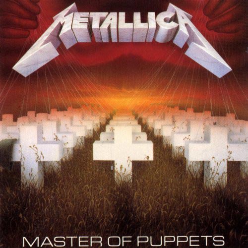
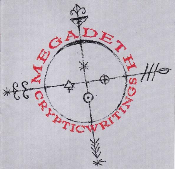
As requested by @ataeaf on Twitter, the latest Tenology post is taking a look at album artwork from Rock/Metal albums that doesn't quite do the music any favours.
Before I start, it should be noted that this post is largely going to be the work of opinion (as always). Art is subjective and what may be absolutely awful to me might be the greatest image in the world to someone else. However, along with each album cover I'll be compiling, I'll be discussing why I strongly dislike the artwork and possibly even what could've been done to improve it, even offering some comparisons to similar but superior artwork to show that I'm not completely talking out of my arse.
1. ...Very 'Eavy ...Very 'Umble - Uriah Heep
The debut album from 70s Hard Prog outfit, Uriah Heep (expect a review of their new album coming soon!). Compared to some of their later albums with fantastic, magical imagery to compliment their Sword & Sorcery themed music, this album cover just looks off-putting. I don't know about you but when I pick up an album, I like to do it without feeling that I immediately need to scrub my hands clean afterwards. Thankfully I've never touched this album physically but just looking at the cobweb covered face of what may be a corpse within the narrative of the cover doesn't entice me to listen to the material contained within. You can also compare this album cover to the similar close-up of a horrified face on In The Court Of The Crimson King by King Crimson. The art style of that album cover and the lack of any additional gross aspects (like sticky cobwebs) makes it striking and intriguing rather than murky and gross.
2. World On Fire - Slash featuring Myles Kennedy and The Conspirators
I know what you're thinking; why am I featuring this album in a list of terrible album artwork instead of Slash's new album, Living The Dream? Don't worry, I'll get onto the terrible album artwork of that one once I review the album on the blog. For now, let's look at this piece of shit. When the single "World On Fire" dropped, the artwork contained a smiley face with a skull inside it (pictured as a tiny, easily missable pic in the top left corner of the album here) and it looked pretty neat! I was expecting a similar treatment of the rest of the band, smiley faces with skeletal influences for all the band members, similar to Deep Purple albums In Rock and Burn or even the Guns N' Roses debut Appetite For Destruction. Instead, we get a load of random junk that's inexplicably themed around The Simpsons. It's ugly and tacky, although I think the ugliness comes from most of the junk being melted. I'm giving the album the benefit of the doubt and guessing the melted crap is because the World is On Fire...get it? Yeah, still a lame cover.
3. Power Metal - Pantera
This is Pantera's fourth studio album. Their fourth. They recorded and released three studio albums before this and this is what the thought was good enough to sell their fourth record. I know most people immediately leap to Metal Magic as the example of terrible album artwork and don't get me wrong, the artwork DOES suck for that one too. However, by the fourth album, you should be trying a bit harder than a black background and a photo of the band doing their best Blue Steels inside a red explosion frame straight outta Microsoft Word. Thankfully, the band did a complete U-turn on their image and music for their next album, Cowboys From Hell. That doesn't mean they get a free pass for what has to be the most embarrassing start for a Metal band in all the history of a genre. Never forget that before they released mediocre Groove Metal amplified by a talented guitarist, they released three Hair Metal albums and one Heavy Metal (not Power Metal) one. Utter shambles.
4. Blind Faith - Blind Faith
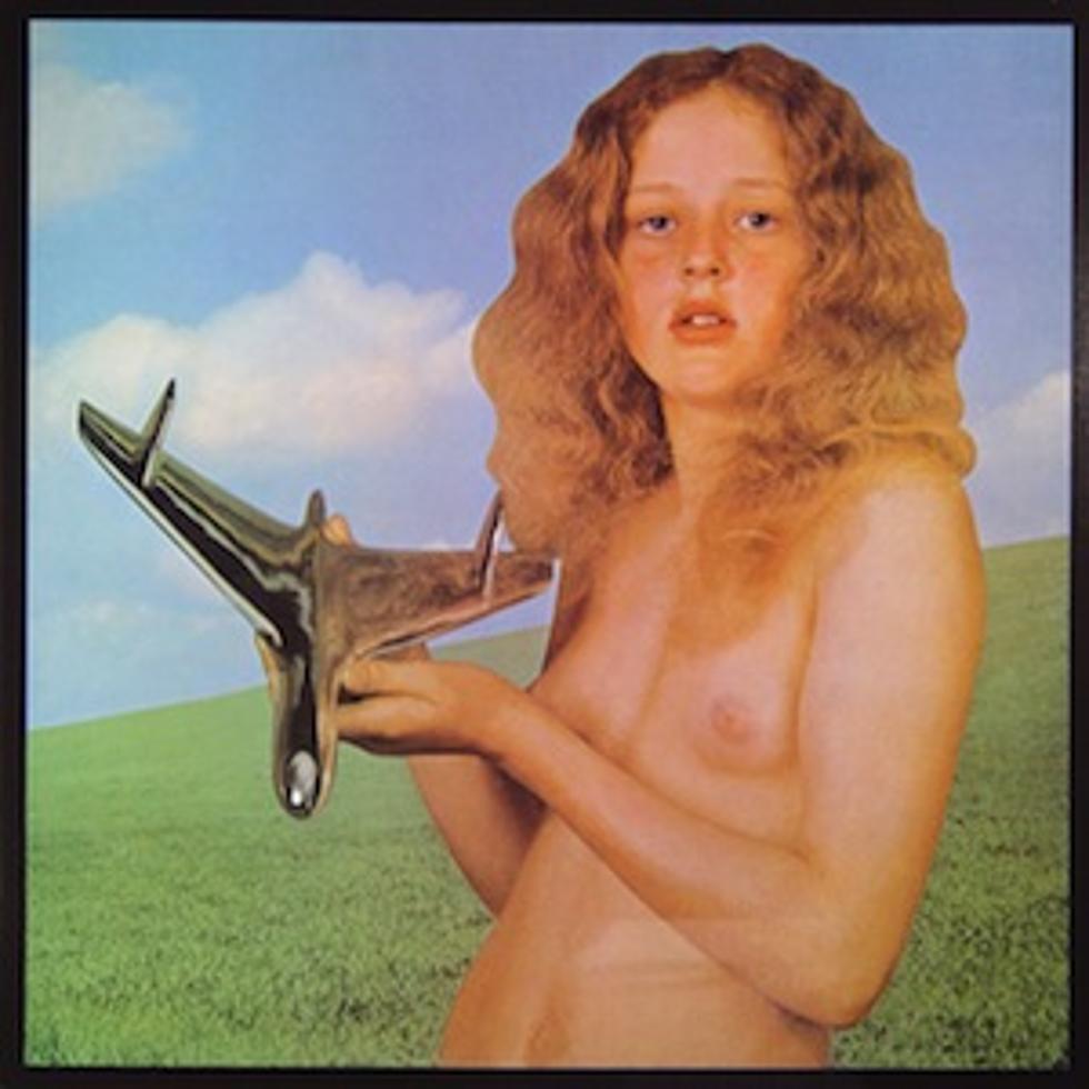
I was hesitant about including the actual album artwork on this blog as this is a picture of a naked 11 year old girl (similar to original album artwork for Virgin Killer - Scorpions, featuring a naked 12 year old girl) in front of what appears to be the Windows XP background about 30 years before the picture was even taken. I'm not entirely sure why these Rock bands want naked pubescent girls as the face of their records, as I wouldn't normally associate Blind Faith or Scorpions with wanting an audience of pedos, but the fact that there is no alternate artwork for this album does it no favours. The artwork should've been...I mean, literally anything else. Literally any other picture that has nothing to do with naked schoolgirls, it's fucking obvious. Anyway, since I had to search for this album cover and ended up finding multiple versions that were all unusable, I'm probably on some kind of register now. Bye guys, it was nice writing for you all!
5. Pinewood Smile - The Darkness
Man, I loved this album but fucking hated the artwork. Where do we start? First off, we've got a smile that looks seedy and kinda gross with the facial hair up-close. Then we've got the weird photoshopping of the band onto the smile in ways that don't quite belong. Finally, there's the complete shift in style from previous artwork such as Last Of Our Kind which featured a great drawing of a fighter pilot similar to Ed Repka's drawings of Vic Rattlehead. I will always prefer a beautifully drawn image over a weird, unsettling and poorly shopped image that may or may not have relevance to the album title. Seriously, if the smile was drawn in an exaggerated, caricatured fashion, this artwork would be a lot better. You know I'm right.
6. Lita - Lita Ford
Whilst it's not quite as disgusting or off-putting as previous album covers listed, I've always had a problem with the album artwork for Lita simply because it's the least sexy cover that's trying to be sexy I can honestly think of. Before you start accusing me of all sorts, I have no problem with Lita Ford's general appearance (she looks pretty damn hot in other album artwork, especially the art for the "Kiss Me Deadly" single). However, the photographer and producer who ended up signing off on this picture being the choice for the album needed a stern talking to. The attractive Lita Ford looks miserable and awkward in this pose, completely the opposite of what they should've been going for. I'm not sure if this is Lita attempting to riff on objectifying and borderline misogynistic uses of women on album covers from the past but it doesn't quite go far enough to drive the point home for me. Instead, it looks like a desperate cougar mom's photoshoot currently mid-midlife crisis.
7. Volcanic Rock - Buffalo
Yup, that's a rock penis being held up by the muscled person with the pubes. That's not all, the volcano pictured represents a menstruating woman as shown by the rear side of the album. It's been heavily criticised in the past for being misogynistic (a word that frequently comes up when discussing terrible Rock album artwork) but much like the band themselves, those complaints faded away and died a death of obscurity...until I went ahead and reminded people that this band and album still exist! Offensive depictions of sexuality aside, the album artwork isn't all that bad. The colour scheme is great and the title Volcanic Rock is a good name for the record; it's just a shame they had to ruing everything by representing the album's title with a stone cock and pussuvius.
8. Lick It Up - KISS
This is just one of the laziest, dullest ideas for an album cover from a band as flamboyant and excessive as KISS. All four band members posing in front of the camera with only one visible tongue on an album called Lick It Up. This is a somewhat iconic album in the KISS collection due to it being the first time they've gone without their signature makeup since taking off. Here's the kicker though; about three years before this album came out, KISS released an album called Unmasked. If EVER there was a time to show the band without makeup, it would've been for that album cover. For Lick It Up, there should've been some stylised drawing featuring tongues and, maybe, a bit of "sexiness" or something other than this last minute attempt at album art. Hell, they could've pulled a Motley Crue and parodied The Rolling Stones with a KISS coloured giant tongue in a grinning mouth. That would've been pretty neat, albeit legally questionable.
9. Mosquito - Yeah Yeah Yeahs
I only found out about this album cover fairly recently and I hate it. However, I can acknowledge that there are some positives about it. For starters, the CGI imagery is pretty crisp and the perspective makes for an interesting angle. However, none of that is enough to redeem the fact that Yeah Yeah Yeahs signed off on an album cover featuring a gigantic mosquito sucking the blood out of a crying child's rectum mid-feed of what looks like radioactive baby food. There's a difference between unsettling album artwork like Americana - The Offspring and this, as one is bizarre yet eye-catching whilst the other's just...well, this. Also, are they ever-so-slightly piggybacking on the iconic album artwork of Nevermind - Nirvana? Maybe I'm reading too much into it, although the whole anus-sucking thing still applies. This is the kind of artwork I'd expect to see on a Shock Rock nobody's record, not some Indie twinks' fourth LP.
10. I Get Wet - Andrew W.K.
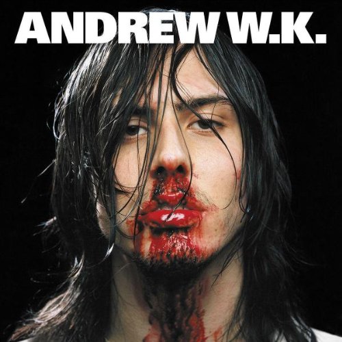
Just have a good look at this prick. With his greasy wet hair and his ruby red lips, how can anyone not want to smack him one? Maybe that's why his nose is bleeding all down his face and fucking neck, someone had enough of this guy constantly banging on about partying and lamped him. Seriously, if you've ever looked at Andrew W.K.'s Twitter account, it's all shit about partying. All the fucking time, it's some bollocks about "party rules" or "never stop partying" and all sorts of crap like he's still desperately clinging to the one song that people know him for. Remember his appearance at E3 when he played that song for the shooter? Can you remember either the name of his song OR the shooter? Guess what, it had thudding percussion and piano in it, almost exactly like his other song. Where was I? Oh yeah, this album cover sucks. Even if my theory about it being a reference to Andrew's punchability is true, it's still off putting to look at and the fact that he looks like 90s Dave Grohl doesn't sit well with me. This should've been an inside sleeve and the outside should've had him looking perfectly fine.
I may do another one of these blog posts in the future if I can find enough examples of terrible album artwork to fill second list WITHOUT resorting to using one from Cannibal Corpse. I'll feature indecent pictures of young girls over one of their fucking covers, Jesus.
The Riffs And Raffs Scale Of Greatness
Showing posts with label Album Covers. Show all posts
Saturday, 29 September 2018
Thursday, 31 May 2018
Rapid Fire: Scorpions, Testament, White Wizzard
Our final post of the month is a quick look at three albums released across different decades that all share at least one common factor. In this case, it's striking album artwork and what better genre to represent high quality album art than Heavy Metal.
The first album comes from a band known for controversial album artwork that often had to be replaced by a less offensive images. That's right, it's NOT Cannibal Corpse because fuck them. It's Scorpions.
1. Blackout - Scorpions
Of all the classic Scorpions albums I've listened to, this is probably my favourite. It also has the best album artwork with Lovedrive coming in at a close second. Anyway, when it comes to Heavy Metal from the 70s, Scorpions are arguably the gold standard. The perfect blend of Klaus Meine's vocals, guitar from one of the Schenkers and percussion from [INSERT DRUMMER HERE] (although Herman Rarebell's work on this album is a highlight) result in a sound that sounds a little more aggressive than typical Hard Rock but not quite as furious as 80s Metal; this is apparent from album opener and title track "Blackout", a fan favourite containing great riffs, a catchy chorus and an outro that maybe could've done without the scream.
From here, the album gives us a healthy variety of commercially oriented Pop Metal ("No One Like You"), slower power ballads that still rock ("When The Smoke Is Going Down"), chugging Heavy Metal ("China White") and fast paced bangers ("Dynamite"). This album has a good hit-shit ratio but the variety does mean fans of faster Heavy Metal might get a little bored during the more casual tracks like "Arizona". Likewise, listeners who want something to chill out to should probably find a different album (or genre) due to songs like "Now!" appearing and shaking you awake.
This album is an all-rounder and definitely a classic that I'd recommend to fans of the genre although it takes its strongest step in the first half. The latter half is made up of deep cuts and afterthoughts that likely won't win anyone over if they hadn't heard any of the album's main singles that all happen to come from the first half. Blackout isn't the best Heavy Metal album in existence but it's certainly a strong contender for one of Scorpions' finest records; definitely one of the best out of their golden years (Virgin Killer to Savage Amusement).
The first album comes from a band known for controversial album artwork that often had to be replaced by a less offensive images. That's right, it's NOT Cannibal Corpse because fuck them. It's Scorpions.
1. Blackout - Scorpions
Of all the classic Scorpions albums I've listened to, this is probably my favourite. It also has the best album artwork with Lovedrive coming in at a close second. Anyway, when it comes to Heavy Metal from the 70s, Scorpions are arguably the gold standard. The perfect blend of Klaus Meine's vocals, guitar from one of the Schenkers and percussion from [INSERT DRUMMER HERE] (although Herman Rarebell's work on this album is a highlight) result in a sound that sounds a little more aggressive than typical Hard Rock but not quite as furious as 80s Metal; this is apparent from album opener and title track "Blackout", a fan favourite containing great riffs, a catchy chorus and an outro that maybe could've done without the scream.
From here, the album gives us a healthy variety of commercially oriented Pop Metal ("No One Like You"), slower power ballads that still rock ("When The Smoke Is Going Down"), chugging Heavy Metal ("China White") and fast paced bangers ("Dynamite"). This album has a good hit-shit ratio but the variety does mean fans of faster Heavy Metal might get a little bored during the more casual tracks like "Arizona". Likewise, listeners who want something to chill out to should probably find a different album (or genre) due to songs like "Now!" appearing and shaking you awake.
This album is an all-rounder and definitely a classic that I'd recommend to fans of the genre although it takes its strongest step in the first half. The latter half is made up of deep cuts and afterthoughts that likely won't win anyone over if they hadn't heard any of the album's main singles that all happen to come from the first half. Blackout isn't the best Heavy Metal album in existence but it's certainly a strong contender for one of Scorpions' finest records; definitely one of the best out of their golden years (Virgin Killer to Savage Amusement).
1. Blackout
2. Can't Live Without You
3. No One Like You
4. You Give Me All I Need
5. Now!
6. Dynamite
7. Arizona
8. China White
9. When The Smoke Is Going Down
ALBUM RATING - 7/10
Next up is an album from 1990, the last year of the truly great Heavy Metal album.
2. Souls Of Black - Testament
When choosing music for this post, it was between this album and Spreading The Disease - Anthrax but in the end, I went with Testament because I've already talked about Anthrax in a Rapid Fire post. Besides, this album needs addressing. First off, we have a fucking great album cover. Along with Spreading The Disease and Peace Sells...But Who's Buying?, it's artwork that I could get lost in and catches your eye when browsing the Metal section of your record store. Then we have the album opener "Face In The Sky" after acoustic intro "Beginning Of The End". Both tracks do a great job of creating atmosphere before giving you some damn fine Thrash Metal to get stuck into.
The album contains some exceptional material that could easily go toe to toe with some of Thrash Metal's finest moments but unfortunately, there's one glaring fault that prevents Souls Of Black from being a shining star: the godawful, horrifically flat mix. When all's said and done, you can compare Souls Of Black to other Metal albums released in the same year like Rust In Peace and Painkiller and the difference in audio quality is night and day. Producer Michael Rosen should be fucking ashamed for ruining what could've been a damn near perfect record, although the producer credits also list Testament as producing so the fault could lie with them too.
Either way, there are a lot of great songs here that are sullied by the terrible mix (as proven by the far superior rerecording of "Souls Of Black" used in Rock Band 2) but if you can get past that, there are plenty of jewels to be found in this trash can. Even when the tracks slow down to take a breather, they still maintain the raw aggression and awesome riffs needed for top notch Thrash. Maybe one day the entire album will get the rerecording treatment instead of just the title track but until then, I guess we'll have to make do with this swing and a miss.
1. Beginning Of The End
2. Face In The Sky
3. Falling Fast
4. Souls Of Black
5. Absence Of Light
6. Love To Hate
7. Malpractice
8. One Man's Fate
9. The Legacy
10. Seven Days Of May
ALBUM RATING - 7/10
The last album is a fairly modern one (2010) but was clearly inspired by Metal greats from the 80s.
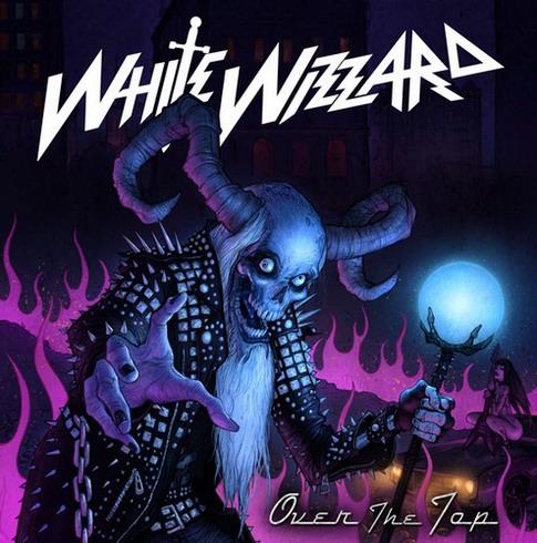
3. Over The Top - White Wizzard
White Wizzard are an American NWOTHM band that MAY have listened to a lot of Iron Maiden and Anthrax whilst growing up, but I'm not completely certain about that. Regardless of their personal taste in music, the band's amplified bass, falsetto vocals and galloping rhythm definitely conjure memories of 80s Metal as demonstrated in album opener and title track "Over The Top". It's a great introduction to the band if you've never heard of them before (which is highly likely) but the real heavy hitters come later on, especially if you're a fan of riff-based Metal and backing vocals perfect for singing along during gigs.
Even though there are more than a few comparisons to their sources of inspiration, the band are easily able to stand up on their own feet. In fact, I'd argue that there's a case to be made that White Wizzard have taken those factors and improved them. Whilst there's the occasional proggy deep cut ("Iron Goddess Of Vengeance"), there are also tracks with mildly progressive elements ("High Roller") that don't go on anywhere near as long as those in modern Iron Maiden or Dream Theater songs, meaning that fans of Heavy Metal that remains tight and energetic will have a lot to enjoy in this album. There's also the fact that vocalist Wyatt Anderson can hit those high notes without sounding too rusty, something Bruce Dickinson is starting to lose if live gigs are anything to go by.
The only main downside to Over The Top is that a great Heavy Metal album has plenty of variety between fast tracks, moderately paced sluggers and slower, more emotional material. This album lacks the slower songs that allow the band to show off their musical talent, instead opting to rewrite the same song ("Live Free Or Die" and "Strike Of The Viper"). As a result, you might feel like the band are a bit one-note if you're not a fan of the song they clearly love. Fortunately, I love that song so this is a great album for me. I definitely recommend it if you want some good old fashioned Heavy Metal.
1. Over The Top
2. 40 Deuces
3. High Roller
4. Live Free Or Die
5. Iron Goddess Of Vengeance
6. Out Of Control
7. Strike Of The Viper
8. Death Race
9. White Wizzard
ALBUM RATING - 8/10
Next month: Hopefully posts that don't all come within the last week, although it does depend largely on personal issues resolving themselves.
Labels:
'10s,
'80s,
'90s,
7/10,
8/10,
Album Covers,
Metal,
Rapid Fire,
Scorpions,
Testament,
White Wizzard
Sunday, 24 April 2016
Metal Album Covers: Dos & Don'ts
Every now and then when I review an album on this blog, I dedicate a sentence or two to a particularly striking album cover. Modern Rock bands tend to go with photographs fresh from Baby's First Pretentious Instagram Post or maybe some soulless CGI guff that tries too hard to be impressive but no genre created a string of album covers fantastic enough to hang in a museum better than Heavy Metal.
I'm not saying the genre had a perfect track record but there's nothing quite like a damn good Metal album cover, hence why I'm focusing entirely on them for this post as opposed to album covers in general. However, despite my love for the genre's artwork, there are examples where the band or whoever pitched the idea to the artist should've thought it through a little more.
Time to look at some of the Dos & Don'ts of creating an awesome Metal album cover with a couple of examples of my personal favourites along the way, in case you care about that sort of trivia.
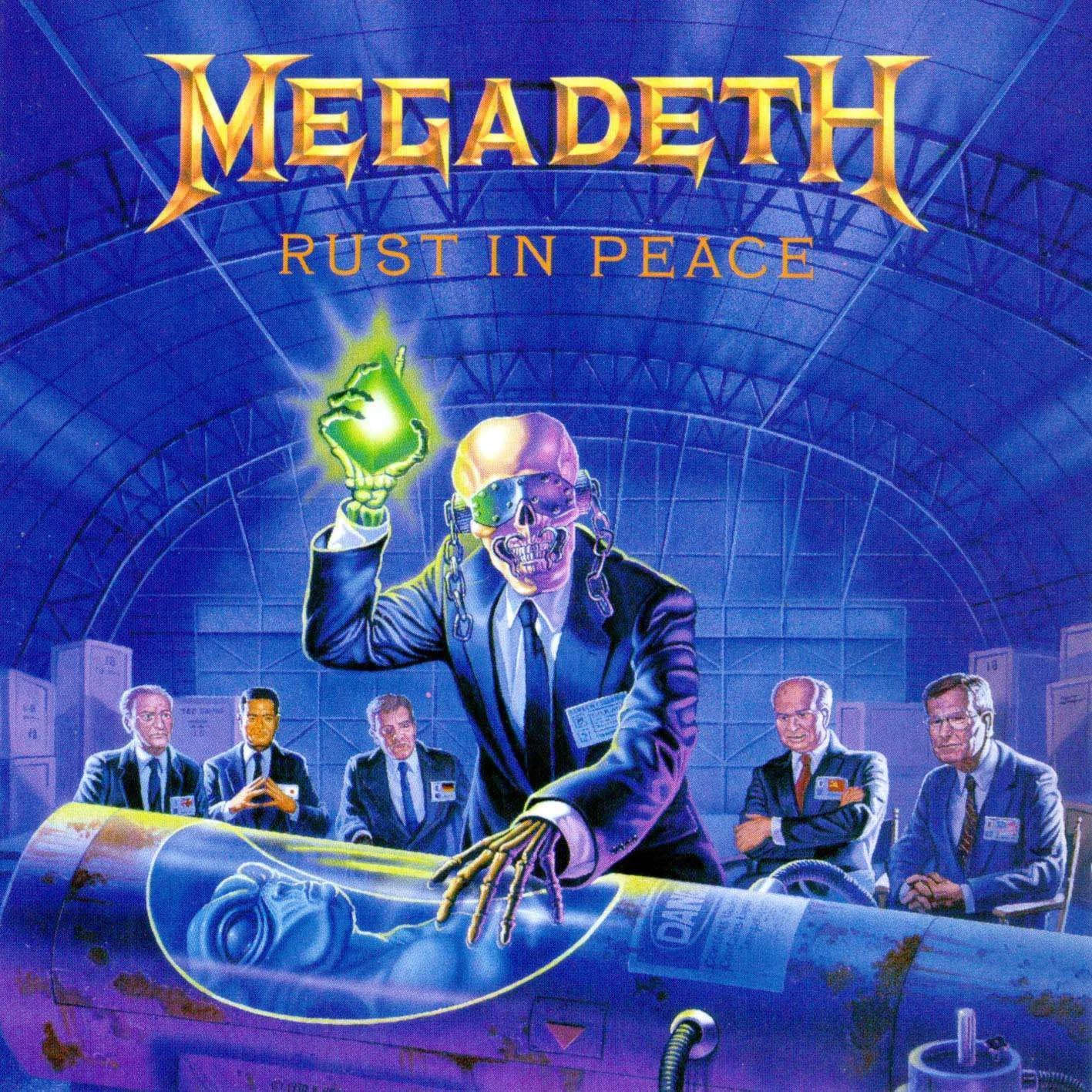
DO relate your cover to the content on the album
This might seem obvious but it's still worth noting. It doesn't have to be a concept album to have a cover related to the name or lyrical content of some of the tracks. Remember, if you thought the subject of one of your songs was strong enough to make it into a worthy title track, why couldn't it do the same for the album cover? It focuses the art so it actually belongs and doesn't just feel like a drawing that's cool for the sake of cool.
Not only that but it helps differentiate a career of striking artwork, compared to the Warpig collection of Motorhead album covers that are all but interchangeable. Sure, they look great in small spaced out doses but I challenge you to name the differences between Overkill, Another Perfect Day and Rock 'N' Roll without looking at pictures of them first.
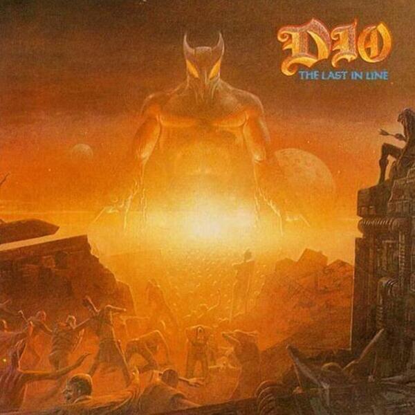
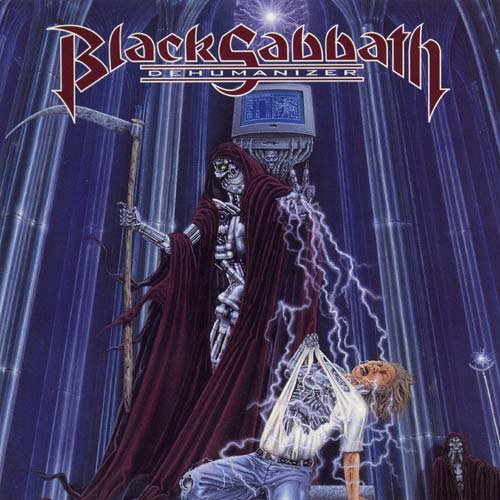
DO base the work around one strong colour (usually blue or red)
The idea behind covers is that it needs to make the object stand out, whether it's for a book, DVD cover or incredible Metal album. The problem with album covers that use realistic photographs is that they blend in, whereas the album covers that perfectly combine realism in the drawings with the use of colour to make it stand out are almost always at the top of Greatest Metal Album Covers lists, or at least they should be.
Not convinced? Let's take a look at some other notable covers.
Point made.
DO try to shock
There's nothing wrong with safe album covers but if you want it to stand out and be truly awesome, you've got to make it eye-catching beyond colour. It's got to leave an impression and one surefire way to do that is to make it visually shocking. It'll make people more likely to give it a second and much longer glance, allowing them to take in the intricate details once the initial shock has faded.
Note that there's a difference between "shocking" and "offensive". Scorpions made this mistake when they released album covers featuring exposed breasts, military grave defiling and naked 12-year olds...consecutively.
DON'T hire a poor artist
No, I'm not saying this is poor and I'm not using poor in the financial sense. It's often quite hard to find information on the artists behind great album covers but most Metal fans will be able to tell you about Derek Riggs and Ed Repka, the artists who gave us Eddie The Head and Vic Rattlehead respectively. These guys create incredible works of art to match the art within the album sleeve itself. However, it's often quite hard to pinpoint what is and isn't great in the world of art...until now, anyway.
Take a look at the album cover above. Pretty fucking cool, huh. Now take a look at the cover below.
The difference is clear. One looks like something out of an acclaimed graphic novel, the other looks like it was painted on the side of a van known for being the only thing rape victims remember in their roofie-induced fugue.
Make sure you pick the right artist, especially in a day and age where it's not exactly hard to find amazingly talented individuals posting their work all over the Internet.
DON'T neglect your mascot
Some bands are known for using a character on their album covers such as The Guy, Murray or the aforementioned Vic Rattlehead. However, sometimes the band decides to take a break from their beloved mascot and goes in a completely different direction. Unfortunately, this new direction is often a worse one as proven by the album cover up above that looks like a bored teen drew it on their workbook in class.
I'm not entirely sure why bands would want to abandon their mascot when they've been established as an iconic unofficial band member, as the whole point of a mascot is to represent their music and image. Changing or even retiring them signifies a change to the band, something that fans are rarely ever happy with, and showing that with pride on the front of your album is a poor way to start the experience off.
Also, I'm aware that I had a pop at Motorhead album covers that use the mascot but my issue there isn't the use of Warpig; it's the lack of interesting designs other than "OOOFIERY-ESPLOSION!". I mean, just look at how many variants of Eddie The Head there have been in the 80's alone.
DON'T use real life photographs on the front
I'll admit that there are some exceptions to this, such as Diary Of A Madman and Vulgar Display Of Power, but real photography definitely feels more appropriate on the inner sleeve or back cover (unless it's a Southern Rock album, then real photography works). In the same way realistic gameplay can make a video game less fun, real life photography can limit what you can include on the artwork unless you decide to fuck it off and fill it with CGI anyway. Remember, this isn't a college photography assignment and just because it's black and white doesn't mean it's deep. It's a fucking Heavy Metal album cover, make it pack a punch!
There's something special about a meticulously detailed piece of artwork, something that just makes the album look like more care and attention has gone into making it awesome that a simple photograph can't even hope to match. Unfortunately, drawn artwork on album covers is now considered quite dated when compared to the average album cover from modern acts such as Avenged Sevenfold and Rob Zombie but thankfully, some new bands are still keeping the tradition alive.
Took me ages to find that last one but I'm glad I did!
So what do you think about Heavy Metal album covers? Did I miss a classic that deserves a shout-out or are there any Dos/Don'ts I neglected to mention? Let me know on Twitter or in the comment section.
Next week I'll try to post a review of the new Sixx:AM album, if I get round to listening to it.
I'm not saying the genre had a perfect track record but there's nothing quite like a damn good Metal album cover, hence why I'm focusing entirely on them for this post as opposed to album covers in general. However, despite my love for the genre's artwork, there are examples where the band or whoever pitched the idea to the artist should've thought it through a little more.
Time to look at some of the Dos & Don'ts of creating an awesome Metal album cover with a couple of examples of my personal favourites along the way, in case you care about that sort of trivia.
DO relate your cover to the content on the album
Not only that but it helps differentiate a career of striking artwork, compared to the Warpig collection of Motorhead album covers that are all but interchangeable. Sure, they look great in small spaced out doses but I challenge you to name the differences between Overkill, Another Perfect Day and Rock 'N' Roll without looking at pictures of them first.
DO base the work around one strong colour (usually blue or red)
The idea behind covers is that it needs to make the object stand out, whether it's for a book, DVD cover or incredible Metal album. The problem with album covers that use realistic photographs is that they blend in, whereas the album covers that perfectly combine realism in the drawings with the use of colour to make it stand out are almost always at the top of Greatest Metal Album Covers lists, or at least they should be.
Not convinced? Let's take a look at some other notable covers.
DO try to shock
There's nothing wrong with safe album covers but if you want it to stand out and be truly awesome, you've got to make it eye-catching beyond colour. It's got to leave an impression and one surefire way to do that is to make it visually shocking. It'll make people more likely to give it a second and much longer glance, allowing them to take in the intricate details once the initial shock has faded.
DON'T hire a poor artist
No, I'm not saying this is poor and I'm not using poor in the financial sense. It's often quite hard to find information on the artists behind great album covers but most Metal fans will be able to tell you about Derek Riggs and Ed Repka, the artists who gave us Eddie The Head and Vic Rattlehead respectively. These guys create incredible works of art to match the art within the album sleeve itself. However, it's often quite hard to pinpoint what is and isn't great in the world of art...until now, anyway.
Take a look at the album cover above. Pretty fucking cool, huh. Now take a look at the cover below.
The difference is clear. One looks like something out of an acclaimed graphic novel, the other looks like it was painted on the side of a van known for being the only thing rape victims remember in their roofie-induced fugue.
Make sure you pick the right artist, especially in a day and age where it's not exactly hard to find amazingly talented individuals posting their work all over the Internet.
DON'T neglect your mascot
Some bands are known for using a character on their album covers such as The Guy, Murray or the aforementioned Vic Rattlehead. However, sometimes the band decides to take a break from their beloved mascot and goes in a completely different direction. Unfortunately, this new direction is often a worse one as proven by the album cover up above that looks like a bored teen drew it on their workbook in class.
I'm not entirely sure why bands would want to abandon their mascot when they've been established as an iconic unofficial band member, as the whole point of a mascot is to represent their music and image. Changing or even retiring them signifies a change to the band, something that fans are rarely ever happy with, and showing that with pride on the front of your album is a poor way to start the experience off.
Also, I'm aware that I had a pop at Motorhead album covers that use the mascot but my issue there isn't the use of Warpig; it's the lack of interesting designs other than "OOOFIERY-ESPLOSION!". I mean, just look at how many variants of Eddie The Head there have been in the 80's alone.
DON'T use real life photographs on the front
I'll admit that there are some exceptions to this, such as Diary Of A Madman and Vulgar Display Of Power, but real photography definitely feels more appropriate on the inner sleeve or back cover (unless it's a Southern Rock album, then real photography works). In the same way realistic gameplay can make a video game less fun, real life photography can limit what you can include on the artwork unless you decide to fuck it off and fill it with CGI anyway. Remember, this isn't a college photography assignment and just because it's black and white doesn't mean it's deep. It's a fucking Heavy Metal album cover, make it pack a punch!
There's something special about a meticulously detailed piece of artwork, something that just makes the album look like more care and attention has gone into making it awesome that a simple photograph can't even hope to match. Unfortunately, drawn artwork on album covers is now considered quite dated when compared to the average album cover from modern acts such as Avenged Sevenfold and Rob Zombie but thankfully, some new bands are still keeping the tradition alive.
Took me ages to find that last one but I'm glad I did!
So what do you think about Heavy Metal album covers? Did I miss a classic that deserves a shout-out or are there any Dos/Don'ts I neglected to mention? Let me know on Twitter or in the comment section.
Next week I'll try to post a review of the new Sixx:AM album, if I get round to listening to it.
Subscribe to:
Posts (Atom)
:format(jpeg):mode_rgb():quality(90)/discogs-images/R-390990-1369561646-8851.jpeg.jpg)

:format(jpeg):mode_rgb():quality(90)/discogs-images/R-1855450-1310683156.jpeg.jpg)

:format(jpeg):mode_rgb():quality(40)/discogs-images/R-855190-1165771725.jpeg.jpg)
:format(jpeg):mode_rgb():quality(90)/discogs-images/R-1790847-1243536628.jpeg.jpg)
:format(jpeg):mode_rgb():quality(90)/discogs-images/R-1724125-1297386186.jpeg.jpg)


:format(jpeg):mode_rgb():quality(90)/discogs-images/R-458175-1512137780-2495.jpeg.jpg)
:format(jpeg):mode_rgb():quality(90)/discogs-images/R-1491957-1223734560.jpeg.jpg)